Stash
Design Lead
Full redesign of onboarding for iOS, Android, and web. Major improvements: Identity verification, subscription selection, and auto-invest set up.
Overview
Stash is an investing app for beginners. It aims to take the complexities out of building wealth. It’s not a meme-stock app or a gambling app. It enables young people to start building wealth for the long-term.
I joined the onboarding team in the early stages of a massive redesign of the entire onboarding flow. Everything was on the table—from value props, subscription selection, and identity verification.
Subscription selection
PROBLEM
As it stands, ~30% of customers who get to the tier selection screen drop off.
The current UI makes it challenging to understand the benefit of each of the tiers and how the packages can support customers in achieving their financial goals.
HYPOTHESIS
By reducing the copy on each tier and using a “this-not-that” pattern we’ll see higher engagement.
With the introduction of some micro interactions we’ll increase exploration of different tiers.

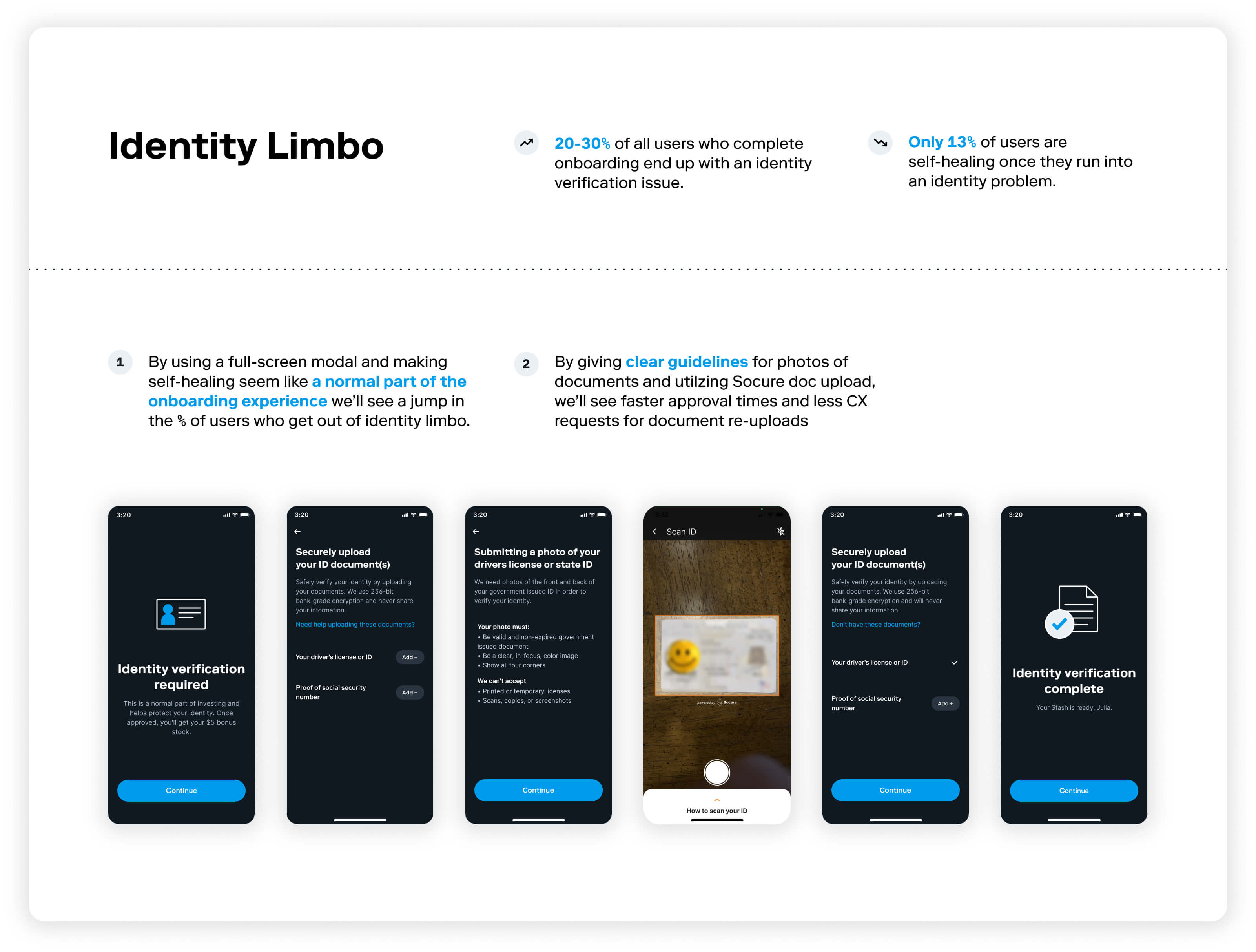
Identity Limbo
PROBLEM
~20-30% of the users that currently make it through the sign up flow end up with an identity problem and never full engage with the product. When users don’t have the proper documentation we stop their momentum and begin the disjointed self-healing process.
HYPOTHESIS
By asking for ID verification immediately after failure and giving users a clear expectation of timelines along the way we’ll see increased engagement with the app.
By allowing users to start investing at different levels while we complete verification in the background we’ll see higher levels of engagement.

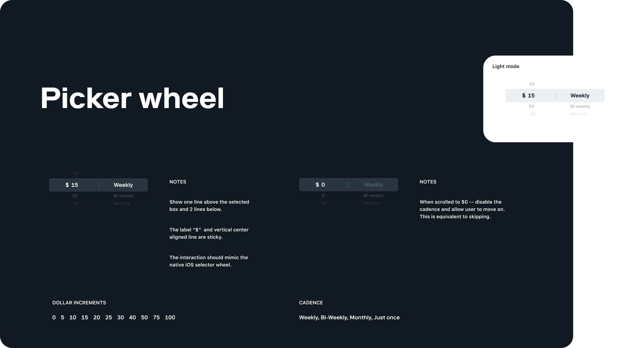
Auto-Invest
OPPORTUNITY
Users who sign up for Auto-invest learn good habits and build long-term wealth more quicky.
HYPOTHESIS
By asking users to set up auto-invest in onboarding and get a reward while do so we’ll see higher levels of engagement.


Case Studies
︎ Coinbase
In Progress
2021-2022
